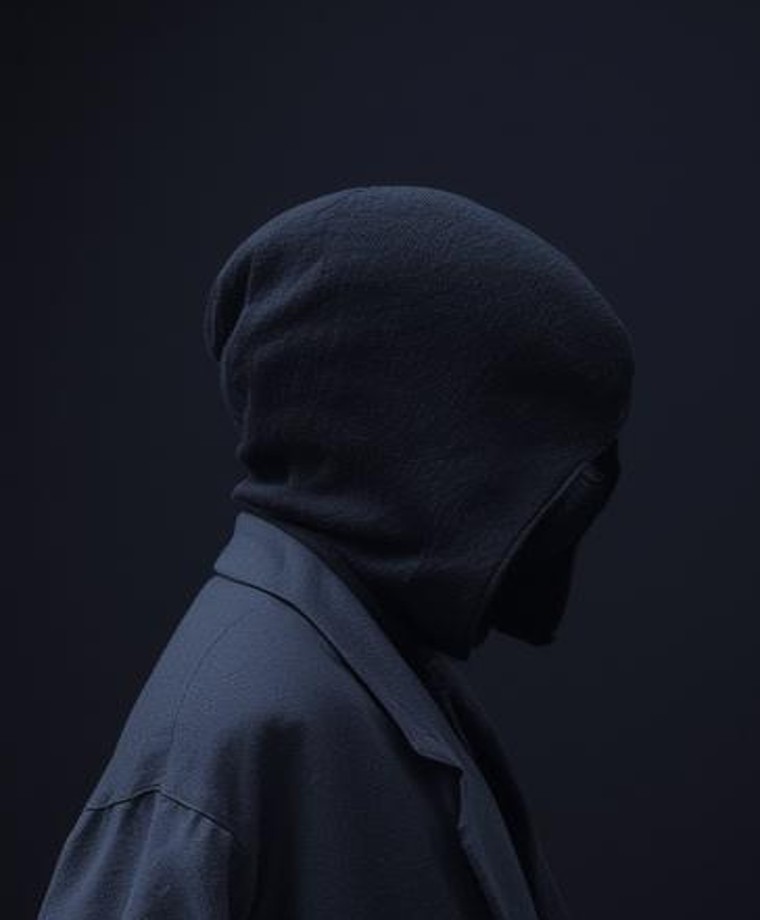
Veil Protocol
Each act of verification confirms an identity while taking something from it. Recognition becomes a form of loss.
Interface / 2026
I design narrative systems, interfaces and archives where fiction is not decoration but structure — something you can enter, test, misread and return to differently.
Enter the works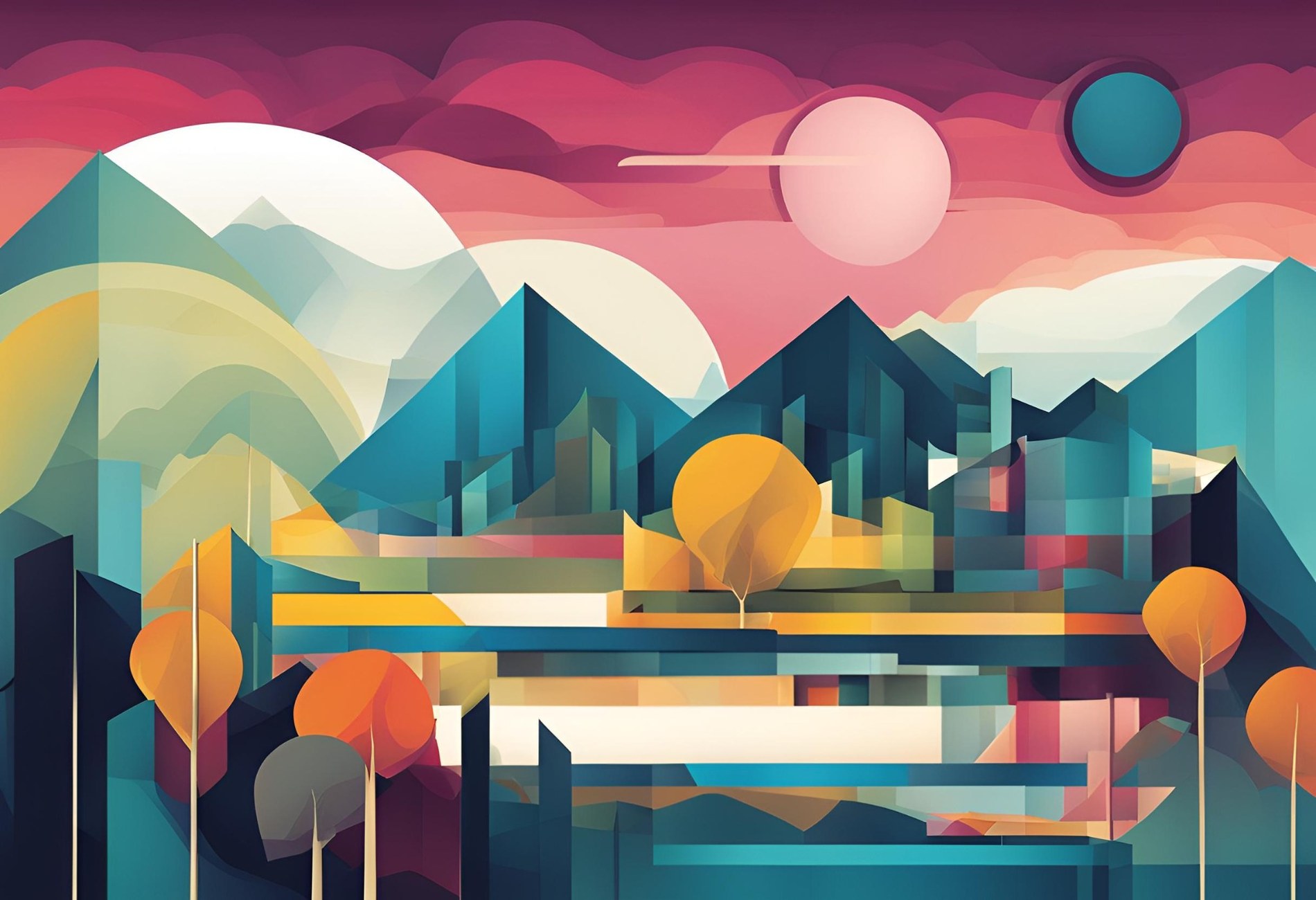 Afterlight GeometrySpatial study
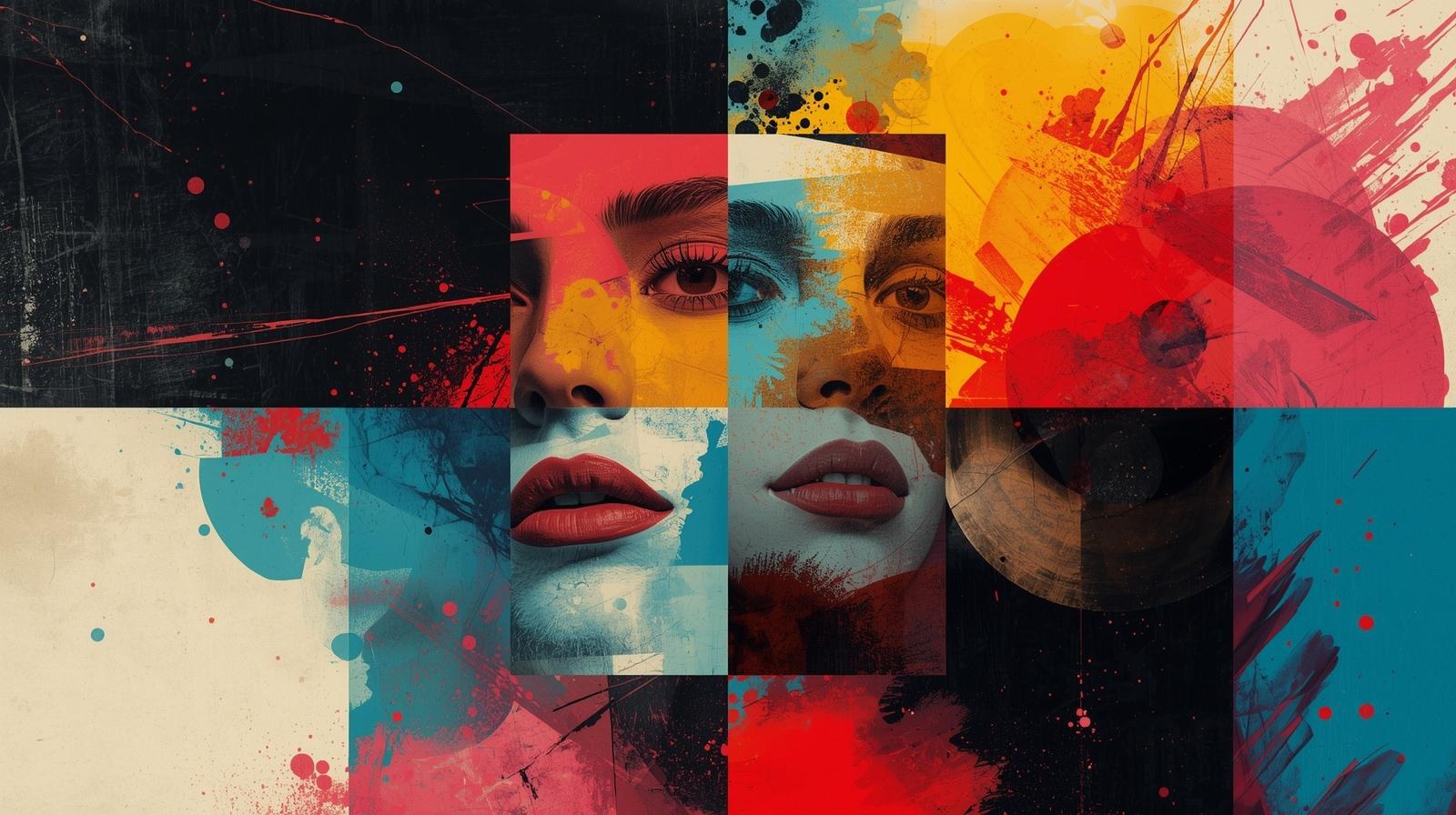
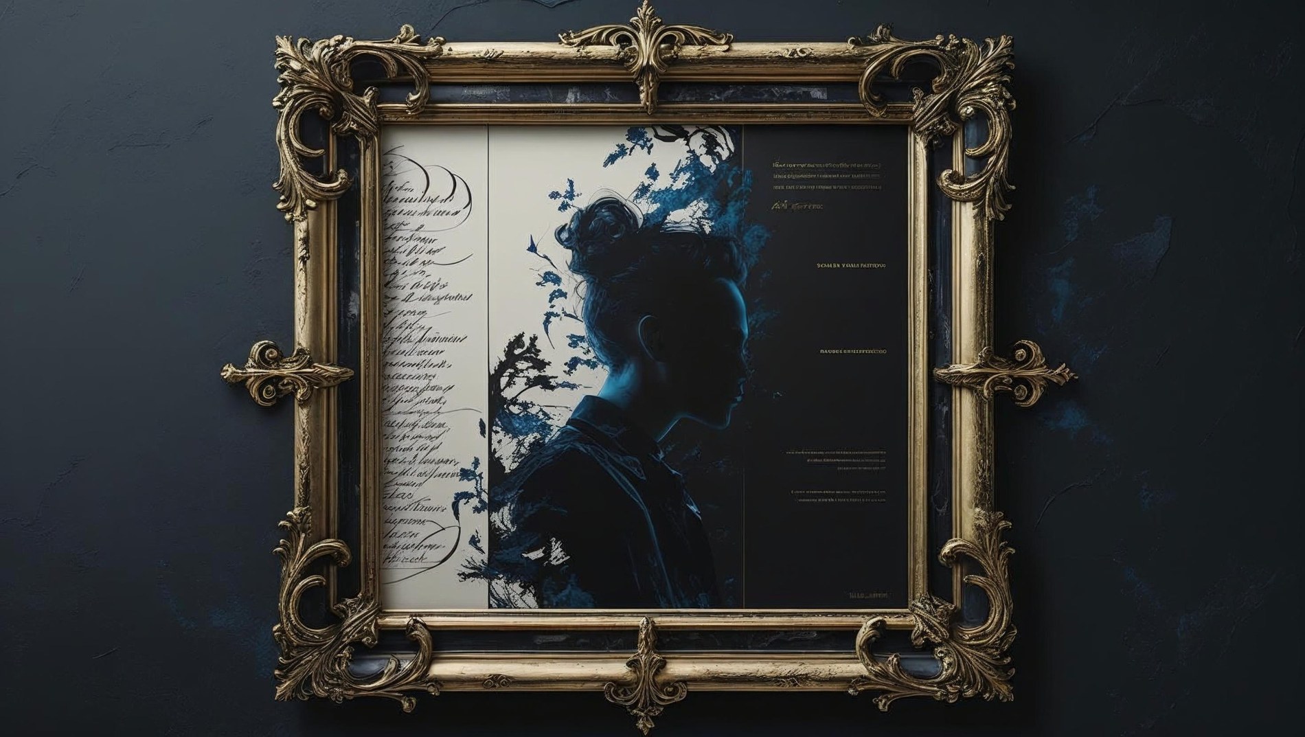
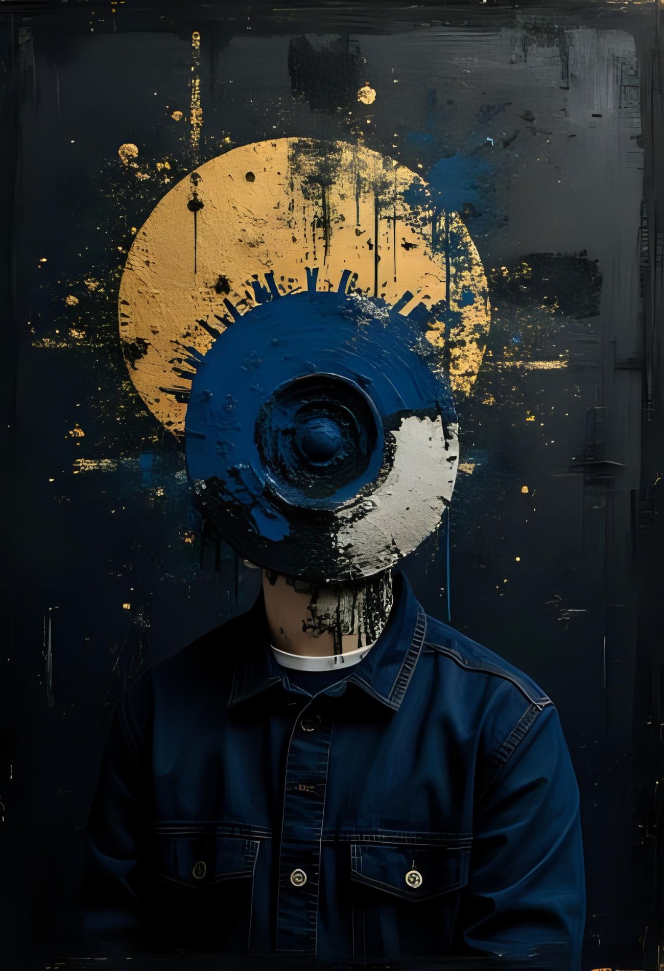
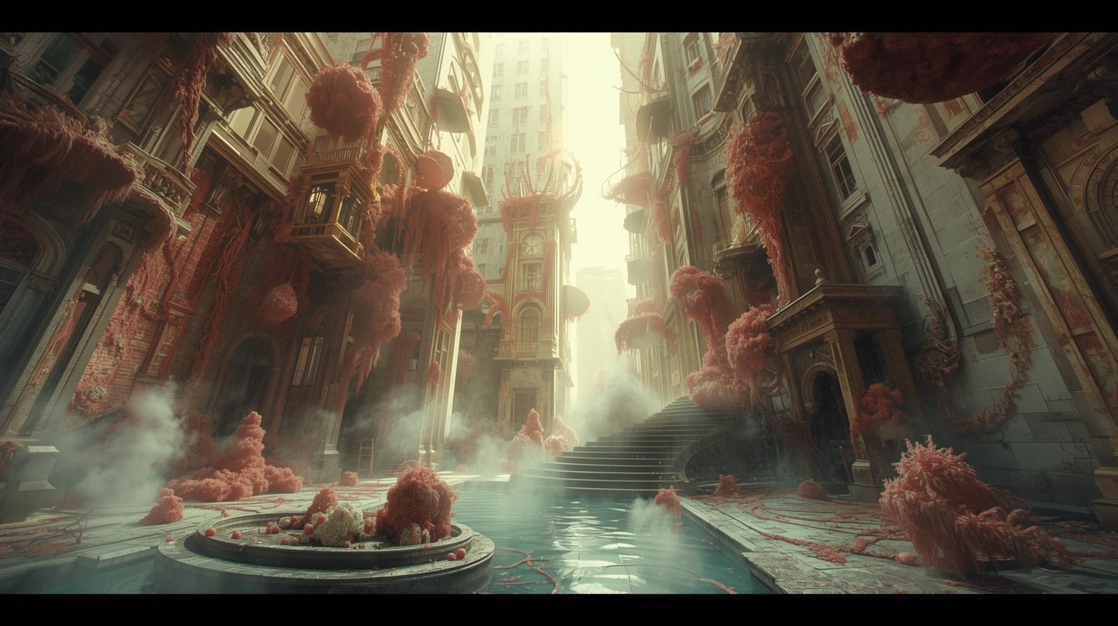
A rule that does not quite hold. A memory with missing edges. A machine that asks the wrong question. I use interface design to give these tensions structure without resolving them too quickly.
The medium follows the pressure point. Sometimes the right form is a website. Sometimes it is a map, a ritual, a bureaucratic system, a field note, a fictional institution or a reader that refuses to behave neutrally.
Interfaces for questions of identity, agency, memory, ethics and perception — where logic is visible enough to be challenged.
Near-future institutions, technologies and protocols designed from the inside out rather than decorated with futurism.
Rules, rituals, ecologies and impossible materials treated with the precision of functioning infrastructure.
Structures in which character, pressure and choice change the reading of an interface — not just its content.
Absence, mortality, uncertainty and time translated into interaction, pacing, access, delay and residue.
Archives, maps, taxonomies and visual grammars that make a fictional world coherent before it becomes fully visible.
Not themes to illustrate. Frictions to keep active long enough for a form to emerge.
I do not use fiction to make software look mysterious. I use the behaviour of software itself — access, hierarchy, memory, permissions, friction, repetition — as narrative material.
The interface becomes less like a picture frame and more like architecture: it decides where you can stand, what you can see, what remains locked, and what changes because you were there.
The practice sits between interface design, fiction and systems thinking. It treats visual coherence as more than polish: every typographic choice, interaction rule and absence of information should tell us something about the world that produced it.
The work moves between calm and unease. Bright surfaces can hide difficult systems; dark ones can contain tenderness. The goal is not a signature aesthetic repeated everywhere, but a recognisable way of seeing.